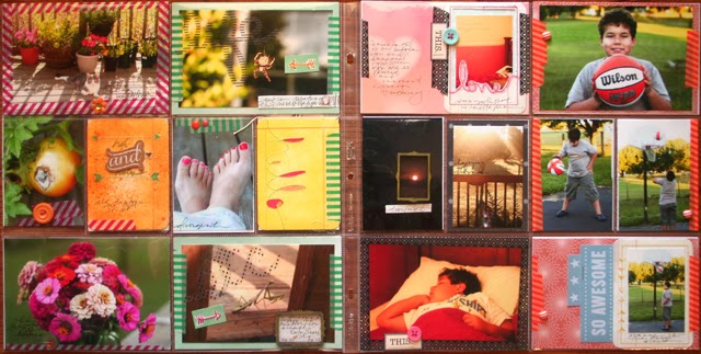
i completed all of these pages with the january jbs mercantile kits plus a little help from my stash. as i've gotten more proficient at knocking out project life pages, i've found that there is a small set of embellishments that i grab on almost ever page. these are:
1. washi tape
2. small bits (most often enamel dots, but also rhinestones, sequins, buttons, and brads)
3. label stickers
4. flatbacks/flair
you'll see these four things scattered on all these pages.
i find the washi tape really helpful in organizing my pages. for example, on this spread, i've used it to divide my photos into four columns of related ideas/events. the fuschia column is plants, the green column is me and the critters outdoors, the black column is g sleeping, and the orange column is g playing basketball. admittedly, i was worried for a while that i'd gone a little crazypants with the color and washi on this one, but in the end i love the way it turned out. i think the vibrant hues match the photos well.
i was also excited to finally use the stitched journaling cards from the historian add-on. they were my favorite, but it took me a long time to find the perfect place for them. i used two of them to frame photos on this side (one i trimmed out to make a real frame while the other just has the photo laid over it). on the page above, i added a little coloring to the stitching and then used it as inspiration to do a little stitching of my own to the arrows.
this spread and the one below are of a 12x12 page protector paired with a 6x12 page protector. these spreads are both events rather than a random assortment of things, so i found that this size nicely held the amount of photos i wanted to include.
i used several bits from the antiquarian add-on for this one. they added a nice woodsy feel. i noticed this page is also very photocentric. i like that. since it is one event, i didn't necessarily need to say a lot about each photo (there's a tag with journaling behind the thread card). i actually like adding just a little writing and embellishing directly onto the photo. also, more photos in less space is usually a good thing.
and here are the last few random pics from september and the photo challenge. on to october!


No comments:
Post a Comment